
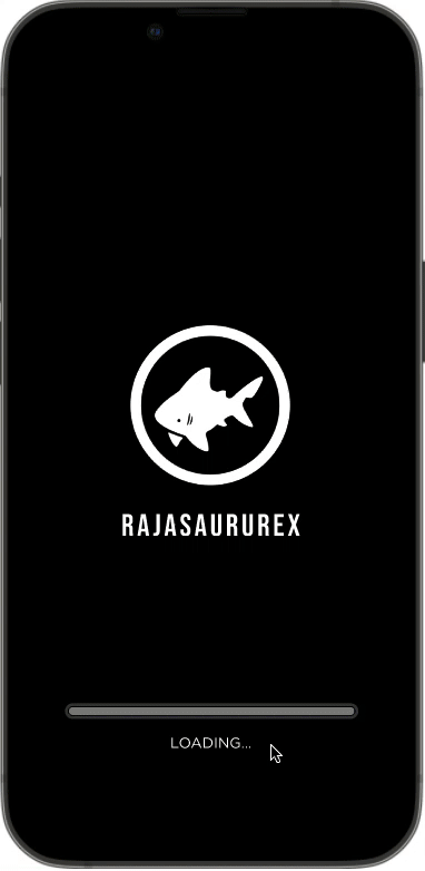
Rajasaurusrex
Project Summary
Rajasaurusrex is a skateboarding and apparel company started by a creative founder who wanted to share her creativity through skateboarding, artwork, and clothing. The founder is a graphic designer that approached makeitMVP with an e-Commerce app design that ties into Rajasaurusrex’s existing website.

Problem Statement
The client had plenty of design ideas of what she wanted her app to look like, but was unsure how to help users progress through the entire shopping experience from product discovery to product purchase.
The Solution
The design team in conjunction with the client and developer team identified the following steps needed to solve the problem statement:
Conduct a UX audit of the existing app design
Create a user flow from product discover to product purchase
Design the missing screens to complete the user flow
Design Team
Surbhi Chelawat, UX/UI Design Lead
Priscilla Cao, UX/UI Designer
Susanne Kianicka, UX/UI Designer
Brian Louie, UX/UI Designer
Robert Chacon, UX/UI Designer
My Contributions
UX Audit
Competitive & Comparative Analysis
User Flow
Card Sorting
Design System - Components
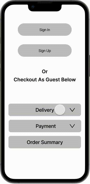
Mid Fidelity Mockup - Checkout Process
High Fidelity Mockup - Checkout Process
Tools Used
Figma
Figjam
Optimal workshop - card sorting
Challenges Faced Throughout the Project

The Creative Client
The challenge we faced the most was to let the client be as creative as she wants to be without sacrificing the functionality and usability of the app. While many of her ideas were beautiful and aesthetically pleasing, they were often not user friendly.
To overcome this challenge, my group and I would advise our client of best practices and provide data from usability testing to back up our advice. We would also create mockups of what users wanted vs what the client had designed to show her the difference. However, even with our advice, data, and mockups, the client would often choose her design.

Scope Changes
Our initial scope of design was to create a business dashboard for Rajasaurusrex rather than working on the eCommerce application. We had spent the first two weeks of the project doing user research and competitive and comparative analyses for the business dashboard. Upon further discussion with the client, we found out that she had an active account with Square which had a feature for a business dashboard. One member of our design team was able to teach her how to use this feature. The client and makeitMVP then decided that the design team work on fleshing out the client’s initial app design idea. Because we had to start over with the research phase, the design team didn’t have enough time to do any more than 1 round of usability testing.
UX Audit
Myself and two other designers divided amongst ourselves the client’s existing designs to conduct an UX audit. We wanted to identify the following:
Areas that may cause user pain points
Gaps in design continuity from product discovery to product purchase.
User Pain Points
We were able to find 5 major pain points:
Menu Icons: Utilize icons that users are familiar with and consider placing the name of the icons below them.
Color Contrast: Rainforest header with white fonts will be difficult for users to see.
Buttons: Sizes and shapes are inconsistent throughout the design.
Fonts: Typography is difficult to read. The sizes and weights are inconsistent.
Section Naming: Can be confusing. Advise to use section names users are familiar with. Ex: Field Journal vs User Profile.
Gaps In Design Continuity
We were able to find the following design gaps:
Checkout process missing (View bag, Shipping Info, Payment Info, Order Confirmation, etc.)
“Housing” for payment and shipping information missing
View All Products screen incomplete
Filtering options missing
Hamburger Menu layout missing
User Profile screens incomplete (My Rewards, My Favorite Items, My orders, etc.)
Events page incomplete
Competitive & Comparative Analyses


Our group did a competitor and competitive analyses of Rajasaurusrex ‘s competitors. I specifically looked at the checkout process of Pacsun, Zumiez, and Tilly’s to gain an understanding of the checkout process of other skateboarding eCommerce apps.
Site Map
This site map was created with the help of card sorting activities performed by users. The site map helped the design team gain a better understanding of how users expect products to be organized.


Persona
Name: Sandra Garcia
Location: Los Angeles, CA
Age: 22
Occupation: Barista at Dutch Bros Coffee
Bio
Sandra is attending UCLA and majoring in filmmaking. She recently started working part-time at Dutch Bros. When she’s not busy with school or work, she likes to spend time skateboarding and learning new tricks at the local skatepark. Now that she’s also making some money on the side, she’d like to buy new skateboards and clothing on a regular basis.
Goals
Sandra would like to buy skateboards and apparel from a non-mainstream brand through an app.
Because she’s busy with school and work, she would like to have her purchases delivered to her house.
Sandra doesn’t like to store her personal info on a new app at first, but would like to have the option to do it eventually.
Task Flow
Keeping Sandra in mind, our group focused on designing 3 key flows for our target user:
Shop as a guest
Sign Up and shop
Sign In and shop
We needed to consider the best and shortest path for each flow as well as consider the best platform to design for before starting our mid-fidelity ketches to brainstorm solutions.


Sketches and Mid-Fi Prototype
Once our group has completed the UX Audit and created user flows, we were then able to create sketched wireframes based on the flows and then created a mid-fi prototype of Rajasaurusrex.

Style Guide
We worked with the client to choose a typography that would fit the Rajasaurusrex brand while also being easy to read for users.
We also created a components library to ensure that our work was consistent and efficient throughout the app design. Components that were created included buttons, text fields, top & bottom navigations, and alerts.
-
Typography
-
Main Components

Usability Testing
Because we had a change of scope 2 weeks into the project by management and the client, the designers didn’t have enough time to do more than one phase of usability testing. We were able to have 10 users test this app and provide feedback. The tasks and results are as follows:
Tasks
Task 1: Create an account
Task 2: Buy a Ladies Tee Shirt called Triangulation
Task 3: Find an event happening in March 2022
Results
Success rate of completing tasks in under 8 minutes was 100%
Success rate of completing task was 100%
Iteration #1
The following were the some of the bigger concerns users expressed while trying to complete the tasks:
Top Navigation: The majority of users stated that the rainforest with white fonts & icons were difficult to read. Many did not initially realize that there was a hamburger menu and the shopping bag. We had pointed this out to the client when we initially performed the UX Audit and now had feedback from users to backup our advice. The client did not want to change the background nor the font colors, so she decided to add a dark overlay to the rainforest background.
Bottom Navigation: The majority of users stated that the wooden planks were distracting from the buttons. Some even stated that the buttons were too small and looked incomplete. We had also brought this to the attention of the client in our UX Audit. After presenting the user feedback, the client did not want to change the wooden planks, so she decided to add a dark overlay as well, and enlarged the buttons.
Appearel Background: Users also stated that the grey background for the tees, tanks, and hats made the app look incomplete. Some thought that perhaps the app was still loading. After presenting these findings to the client, she decided to keep the grey background regardless of what users stated.

High Fidelity Mockup
Based on the usability feedback we received from users, we were able to implement changes approved by client and create the high fidelity mockup below. Please feel free to click through the mockup using this link.
Next Steps
Our group of designers recommended our client to explore the following options for future iterations:
Do another round of usability testing for the updates made on iteration #1 and implement user feedback
If the client decides to keep section names that aren’t familiar to users, consider making tutorial screens for users to become familiar with section names
Add option to allow customers to give reviews and star ratings for products
Add push notifications to alert customers of new products and special offers to increase business revenue
